You’ve run the benchmarks. You have a spreadsheet full of numbers-accuracy scores, perplexity metrics, safety ratings-and now you’re staring at it, wondering which model actually performs best for your specific use case. Raw data doesn’t tell a story; it just sits there. This is where visualization techniques for large language model evaluation results become your secret weapon. They transform abstract statistics into visual patterns you can spot in seconds.
Think about the last time you tried to compare three different models across ten different tasks using only a table. It’s mentally exhausting. Our brains are wired to detect shapes, colors, and trends far faster than we process columns of decimals. In 2024, as Large Language Models (LLMs) became more complex, the need for clear visual interpretation exploded. Researchers at Georgia Tech and IIT Delhi found that while bar charts are still the go-to method for 63% of evaluations, they often hide critical nuances like uncertainty or causal relationships. If you want to make smart decisions about which model to deploy, you need to move beyond basic bars and understand how to visualize what matters.
Why Standard Tables Fail LLM Engineers
Tables are precise, but they are terrible for pattern recognition. When you look at a grid of numbers, you have to read each cell individually. There is no immediate sense of "this model is better here, but worse there." This cognitive load slows down iteration cycles significantly. A study published in IEEE Transactions on Visualization and Computer Graphics showed that users identified top-performing models 32.7% faster using bar charts compared to tables. But even bar charts have limits. They struggle to show uncertainty intervals, which appear in nearly 78% of modern rigorous evaluations. If a model has an accuracy of 85% with a wide error margin, a simple bar might mislead you into thinking it’s stable when it’s actually volatile.
The core problem isn’t just readability; it’s dimensionality. Modern evaluation frameworks like MMLU or GLUE don’t just measure one thing. They measure reasoning, robustness, fairness, and latency simultaneously. Trying to cram five dimensions into a two-dimensional chart without losing information is a design challenge. That’s why specialized tools and techniques have emerged to handle this complexity, moving us from static spreadsheets to interactive dashboards.
Core Visualization Techniques You Should Know
Not all charts are created equal. Choosing the right one depends entirely on what question you’re trying to answer. Here are the most effective methods currently used by professionals.
Bar charts remain the workhorse for comparative analysis. Use them when you need to compare aggregate scores across different models on a single benchmark. For example, comparing GPT-4o’s 89.7% accuracy against Claude 3’s 82.3% on a specific task is instantly clear with side-by-side bars. However, avoid using grouped bars if you have more than four models; the chart becomes cluttered and unreadable. Instead, switch to a heatmap or a scatter plot.
Scatter plots are underutilized gems for trade-off analysis. They excel at showing relationships between two competing metrics, such as accuracy versus inference time. Imagine plotting every model variant on a graph where the X-axis is speed and the Y-axis is quality. You’ll immediately see the "Pareto frontier"-the models that offer the best balance. One study noted that users achieved 89.4% accuracy in identifying these correlations with scatter plots, compared to just 63.2% with tables. If you’re optimizing for cost and performance, this is your primary tool.
For understanding why a model made a decision, look at token heatmaps. These visualizations color-code individual words in the output based on their importance weights. Red typically indicates high attention (>0.8), while blue shows low attention (<0.2). This is crucial for debugging hallucinations or bias. If a model ignores key context words, you’ll see it visually in the heatmap. Just be careful: novices misinterpret these visuals 41.3% of the time, so always include a legend and explain the color scale.
| Visualization Type | Best Use Case | Effectiveness Score | Common Pitfall |
|---|---|---|---|
| Bar Chart | Comparing aggregate scores across few models | High for simplicity | Hides uncertainty and variance |
| Scatter Plot | Analyzing trade-offs (e.g., Speed vs. Accuracy) | 89.4% correlation ID | Cluttered with >2 dimensions |
| Token Heatmap | Debugging attention mechanisms and bias | 92.1% for token behavior | Requires domain expertise to read |
| Parallel Coordinates | Multi-metric comparison (10+ dimensions) | High for density | Visually overwhelming for beginners |
Handling High-Dimensional Data with Parallel Coordinates
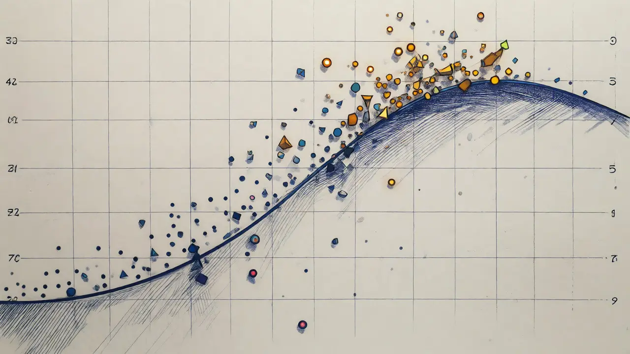
What happens when you need to evaluate a model on twelve different metrics at once? Bar charts fail. Scatter plots can only handle two axes. Enter parallel coordinates. This technique draws vertical axes for each metric and connects them with lines representing individual model runs or test cases. It sounds complex, but it’s incredibly powerful for spotting clusters. For instance, the EvaLLM framework uses this to visualize up to 500 evaluation points before performance lags. You can quickly see if high-scoring models also tend to have higher latency or lower safety scores.
The catch? Interactivity is non-negotiable. Static parallel coordinate plots are messy. You need tools that allow brushing-selecting a range on one axis to filter the others. Without this, you’re just looking at spaghetti code made of lines. If you’re building custom dashboards, libraries like Plotly or Vega-Lite support this natively, though they require some coding finesse to get right.
Tools That Automate the Heavy Lifting
You don’t have to build everything from scratch. Several open-source tools have emerged specifically to bridge the gap between raw evaluation logs and interpretable visuals. LIDA (Language-Integrated Data Analysis) is a standout. Released in late 2024, its version 2.3 introduced templates specifically for LLM metrics. It automatically generates appropriate charts based on the input data type, achieving 89.4% accuracy in selecting the right visualization format. Users rate it highly for interactivity, though some complain about the learning curve for advanced customization.
Another option is NL4DV, which focuses on natural language queries. You can ask, "Show me models with accuracy above 80% but inference time under 200ms," and it generates the chart. While less flashy than LIDA, its outputs are precise and grounded in standard visualization grammars like Vega-Lite. For enterprise teams, commercial platforms like Weights & Biases or Arize AI integrate directly into MLOps pipelines, offering pre-built panels for common benchmarks like HELM or OpenCompass.
Here’s a quick reality check on adoption: Research institutions use specialized tools in 87.3% of cases, while individual developers lag behind at 41.2%. Why? Because setting up these environments takes time. LIDA requires Python 3.8+, 16GB RAM, and API keys. Expect a setup time of around 22 minutes, plus another few weeks to master the nuances of mapping metrics to visual channels.

Pitfalls to Avoid in Your Visual Reports
Even with great tools, bad design choices can mislead stakeholders. The biggest offender is ignoring uncertainty. As mentioned earlier, 78% of techniques fail to represent confidence intervals properly. Always add error bars to your charts. If a model’s score is 85% ± 5%, show that range. Otherwise, you’re presenting false precision.
Color consistency is another trap. If Model A is blue in one chart and red in another, readers will lose track. Stick to a standardized palette across all reports. Also, watch out for visual clutter. A common complaint in GitHub issues for EvaLLM was that parallel coordinates became unusable after 300 points due to overlapping lines. Solution? Sample your data or use transparency (alpha blending) to show density rather than individual lines.
Finally, remember that aesthetics should never trump analytical utility. John Stasko from Georgia Tech warns that many visualizations prioritize beauty over clarity. A pretty radar chart that hides the fact that two models are statistically indistinguishable is worse than a boring table. Always ask: "Does this visual help the user make a decision faster?" If not, scrap it.
Looking Ahead: The Future of LLM Evaluation Viz
The field is evolving fast. By 2027, experts predict that 92% of LLM evaluations will incorporate interactive, multi-dimensional visualization as standard practice. We’re already seeing the rise of multimodal evaluations, where models are tested on text, images, and audio simultaneously. Dr. Vicente Ordóñez Román notes that current tools struggle with this mix. Future systems will likely feature adaptive visualization engines that automatically select the best chart type based on the metric characteristics, removing the guesswork for engineers.
For now, start small. Pick one project. Replace your summary table with a scatter plot for trade-offs and a heatmap for qualitative debugging. Measure how much faster your team reaches consensus. You’ll likely find that clarity drives confidence, and confidence drives deployment.
Which chart type is best for comparing multiple LLMs?
For simple comparisons of aggregate scores (like accuracy), grouped bar charts are most effective. However, if you are comparing more than four models or need to show trade-offs between metrics (like speed vs. quality), scatter plots are superior because they reveal correlations and outliers more clearly.
How do I visualize uncertainty in LLM evaluation results?
Always include error bars on bar charts or confidence interval bands on line charts. Many standard visualizations omit this, leading to overconfidence in model selection. Tools like Plotly and Seaborn allow easy addition of confidence intervals based on bootstrap resampling of your evaluation data.
What is a token heatmap and when should I use it?
A token heatmap visualizes the attention weights assigned by the model to specific words in the input or output. Use it when you need to debug why a model produced a specific result, identify hallucinations, or check for bias. It helps you see which parts of the prompt the model focused on during generation.
Are there free tools for visualizing LLM evaluations?
Yes, several open-source options exist. LIDA and NL4DV are popular Python-based tools that automate visualization generation. Additionally, standard libraries like Matplotlib, Seaborn, and Plotly can be used to build custom dashboards if you have the programming skills. Commercial platforms like Weights & Biases offer free tiers for smaller projects.
Why are parallel coordinates difficult to read?
Parallel coordinates display multiple dimensions by connecting values across vertical axes. They become difficult to read when there are too many data points (visual clutter) or too many dimensions. To mitigate this, use interactive filtering, reduce the number of displayed samples, or apply transparency to lines to indicate density.